16 Free CSS Layouts for User Interface Designers 2026
Here are the most versatile CSS layouts for your web development project.
How do websites get all that interesting content alignment, colors, and flexibility? It’s because of CSS! Think of CSS as the suit of the web. It’s the extra coating on the cake that makes it look wonderful. And while we can’t taste the web, we can enjoy it to the fullest when designers take their time to provide unique, ambitious, and stellar web browsing experiences. Getting started with CSS has never been easier; now, hundreds of books, frameworks, and coding websites provide an onboarding experience that helps you understand how the web is styled. The best part is that you can contribute to those styling efforts!
So, without further ado, we’re giving you 15 of the most versatile CSS layouts built by CSS veterans. These designs and layouts are ready-to-use for your projects or to help you understand how layouts work. It’s a wonderful collection of layouts that will inspire you as you realize how much CSS has progressed and how a slight addition of interactive JS code can make all the difference. At the bottom, we included some famous CSS layout frameworks to help you quickly style a responsive and modern layout.
Best CSS Layouts For Your Website
1. Pure.css
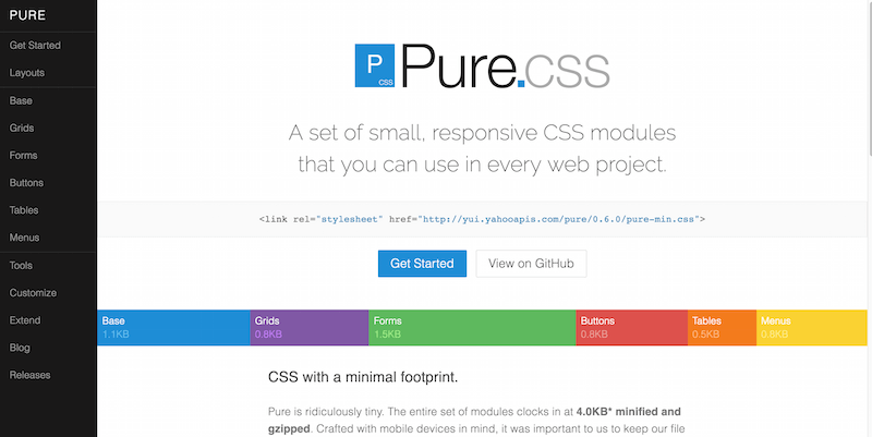
With all those beautiful CSS layouts we looked at, you still realize something is missing. You could place the web elements and components to create a fully functional website. Sure, coding them is possible, but why waste time when you’ve got frameworks like Pure? Pure provides you with several layout options itself. These include blogs, emails, photo galleries, landing pages, pricing tables, side menus, and other menus.
You can stitch these layouts together and begin building a unique web design. The components that come with Pure are grids, buttons, tables, forms, and menus. All of these effortlessly flow as you put them all together. Including Pure and writing some CSS ensures that your site or app works properly across browsers. It will even look truly unique. Best of all, your CSS file size will remain tiny. This feature is particularly beneficial for mobile users and those with slower connections.
2. Colorlib CSS Website Layouts
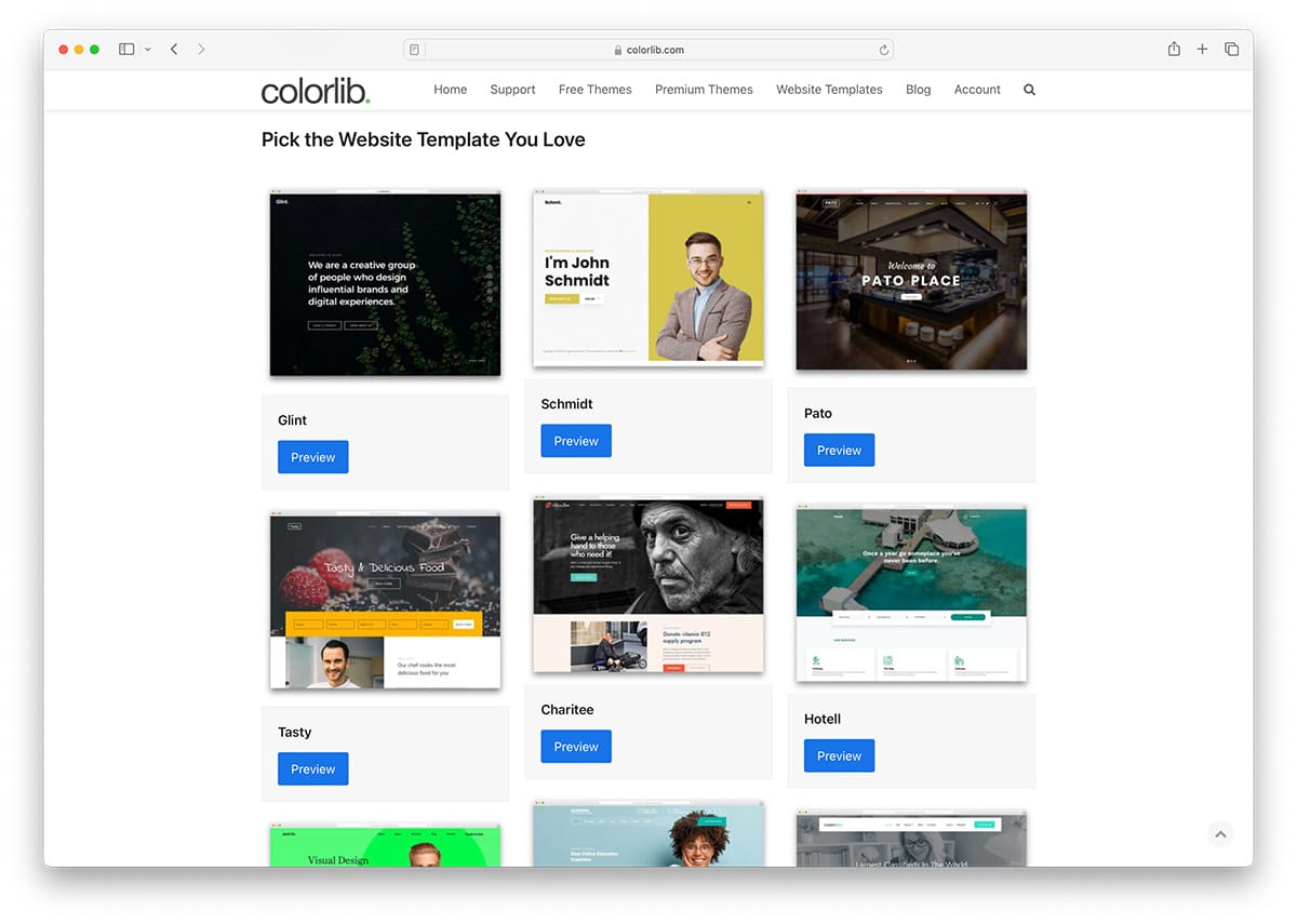
Colorlib boasts the largest library of CSS layouts, comprising over 2,500 designs ranging from simple blogs to vendor marketplaces and membership websites. All the layouts are made with performance in mind.
3. Expanding Column Layout
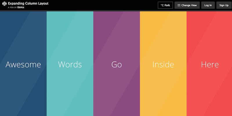
Ettrics is a small digital design agency in Canada. Two guys manage this little agency and have created incredible works of art that thousands of designers worldwide have recognized. They’ve also shared some cool CSS snippets in the past, such as hexagon animations, slider animations, menu overlays, drag-and-drop interfaces, and interactive bar graphs — adding up to over 100,000 views in total.
They’re also not shy about writing and sharing tutorials with the community. They have extensively written about how designers can create user interface kits and appealing user experiences using good design understanding. The developers also built this layout called the Expanding Column Layout. Audiences have viewed this layout more than 30,000+ times already. Once you access this layout, you will see a simple page layout perfect for portfolios, featuring different color columns that can be expanded individually. Within the expanding window, you can add any content that you like.
4. Fullscreen Layout with Columns
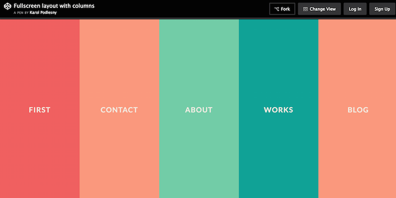
Karol Podlesny has modified the work of Ettrics, changing the schematics. You also get a different set of colors, and slightly more optimized expanding windows for sharing content. Worth sharing to save time from managing colors individually! Moreover, it’s full screen and gracefully adapts to mobile devices.
5. Static Page Layout Example
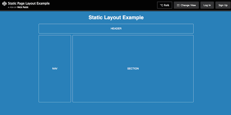
Nick Pettit is an exceptional game developer and one of the in-house course teachers at Treehouse, a renowned developer learning resource. Nick has built this layout as an example of how a static website layout functions and how you can use such a static layout to build prototypes without necessarily having to invest the hours required to provide a flawless functioning demo.
Looking for something much more advanced? Here are the best static website CMS.
6. Product Page Layout with Flexbox
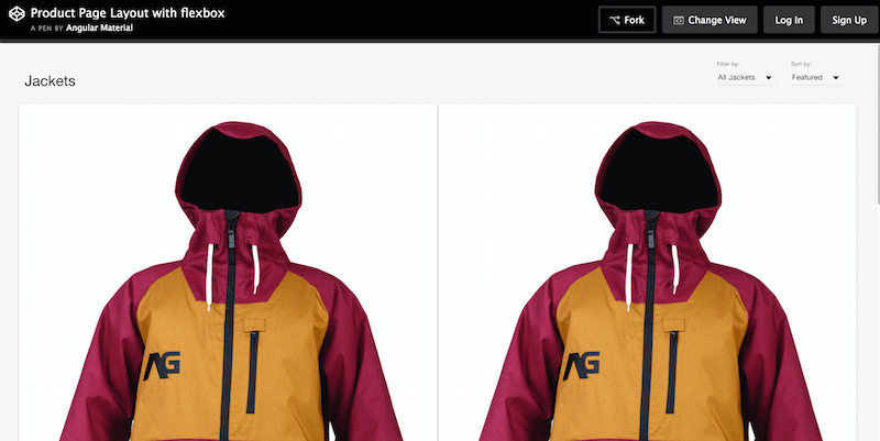
The official team behind Angular.js is also actively sharing different snippets and code structures to create particular layouts. As such, Angular Material gives the community a solid Flexbox layout for product pages. The developers packed this theme with individual product grids for featured and ordinary displays. They also gave this product the ability to sort and filter results. Wonderful results altogether. This gives you a taste of what to expect from the new Angular framework, amplified by the Material Design specification.
7. Beautiful CSS3 Layout
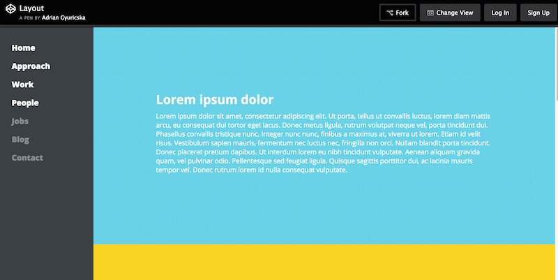
Adrian Gyuricska has produced a very neat little CSS layout ideal for hosting a portfolio page, but could be converted into a single-page blog layout. What we like most is the smooth sidebar enriched with links, and the colorful element layout divided into different sections. There is also some JavaScript action happening, and the template is styled with Jade and SCSS.
8. Flexbox Grid Layout with Mobile Menu
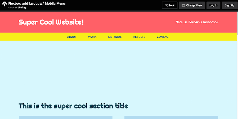
Lindsey Di Napoli is behind CSSgirl — a portfolio/resource project that depicts her career as a front-end designer. She’s built some impressive projects in her time, and the Flexbox Grid Layout (with supported mobile navigation) is one of her best works to date, at least in terms of free sharing; we’re sure she has worked on some truly inspiring projects in the past as well. So, either way, this layout again demonstrates how you can utilize Flexbox to create a visually appealing and perfectly aligned design. We like cards within the content areas, with neat little overlays that display social sharing buttons.
9. Responsive Card Layout with Flexbox
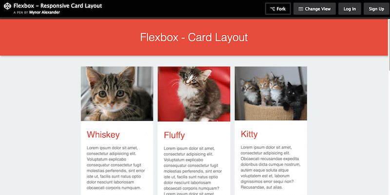
Mynor Alexander can teach you a few things about Flexbox and card layouts; you don’t need to see him in person! It’s all right within the source code of this Responsive Card Layout built using Flexbox. Nowadays, the adaption of card layouts is continuously growing; their value for design experience is invaluable. And so, it goes without saying that learning how to use cards in design as a front-end developer will be quintessential for progressing to the future of web design.
10. CSS Only Responsive Layout with Smooth Transitions
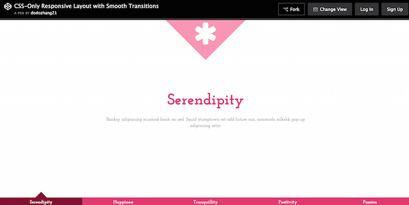
Ying Zhang works with several big brands as a web developer and hosts her project, Pure Essence, to discuss her progress in her career. Among the snippets she has shared, you’ll find this pure CSS layout with a smooth transition, all fully responsive. The transitions happen through a menu selection at the bottom of the page. Once you click on an item, a new page rolls open with a smooth transition. Furthermore, you can customize each page aspect to fit your requirements. Lovely example of how to build interactivity on the web.
11. Grid with Layouts
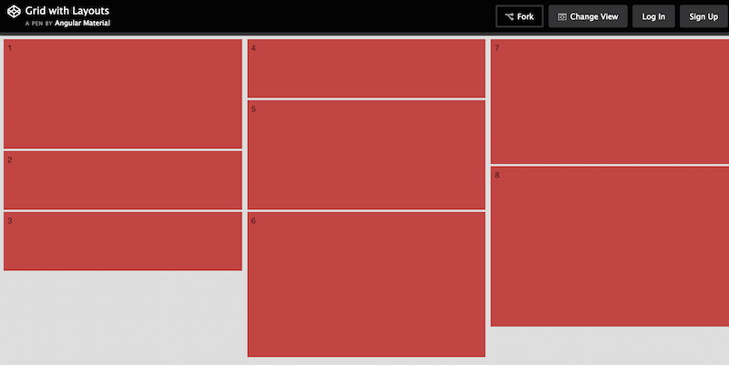
This is yet another share from Angular Material; this time, they share a simple grid layout that you can use as a boilerplate for future design development. Keep an eye on their CodePen page as they continue to push out new layouts and concepts in preparation for the full release of Angular framework.
12. Flexbox Article Layout
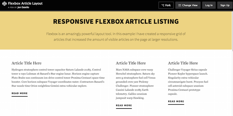
Jon Daiello has worked on many great projects involving product design and development. Here, in this layout, he demonstrated just how flexible Flexbox can be when structuring a layout for content. Whether for magazine or blog articles, with Flexbox it is possible to attain that crisp quality that you won’t find elsewhere. This Responsive Article Layout is built to resemble a traditional content layout within a grid. This is the same layout Jon uses on his website, which is another saying he trusts his work. The header and footer areas could use some improvement, and perhaps all you need to take away from this layout is the actual structure of the grid itself.
13. Responsive Vertical Timeline
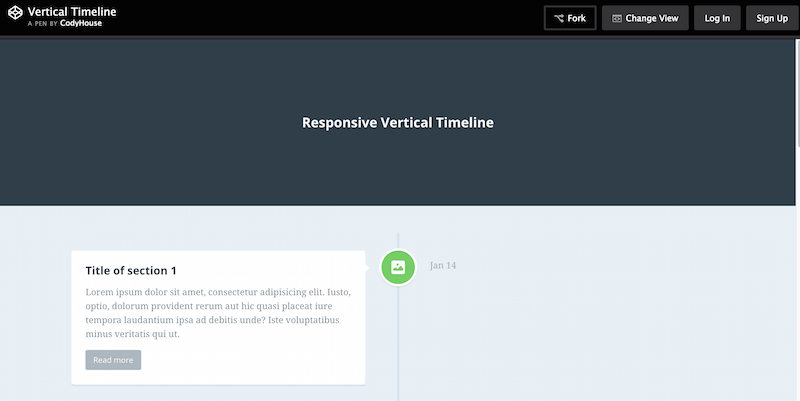
CodyHouse is a free library of ready-to-use and easy-to-customize code snippets. CodyHouse releases a new snippet or script, accompanied by their tutorials and guides. These guides and tutorials can help you understand how the code works and achieve the desired results. In this example, we have a Responsive Vertical Timeline layout. You can use it ideally on business websites or portfolios where you want to showcase how much you progressed. It would be unusual to see this design in magazines. But, you can get away with certain blog type sites using a timeline layout. Those who publish the latest business updates and news can also utilize this feature.
14. Fixed Daily Kitteh
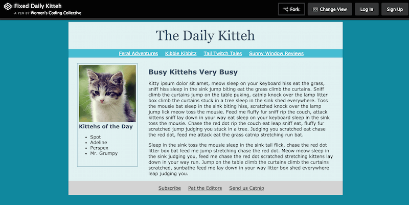
The WCC, also known as Women’s Coding Collective, is a community of developers strictly aimed at helping women. WCC empowers them through writing code. It can bridge the gap between the gender roles in web development communities today. WCC offers women guidance and resources to help them launch their careers as developers. This Daily Kitteh layout example is just one example of the kind of work that WCC offers for learning. Women can learn how to structure a nice and static website page. WCC can also help them understand how all elements work together to achieve the final result.
15. Spotify Artist Page UI
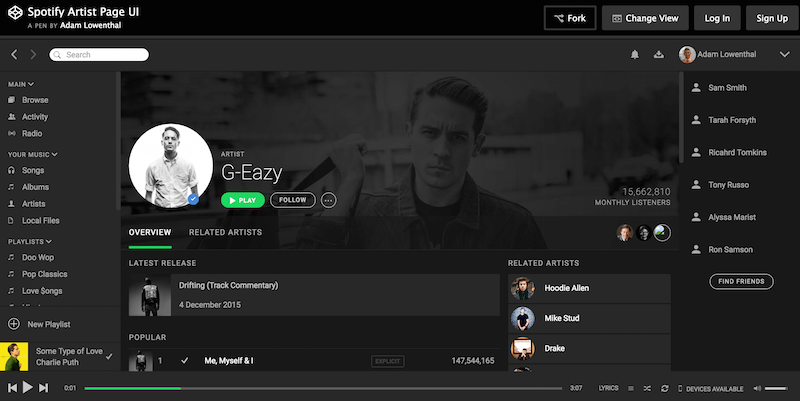
Adam Lowenthal shares an impressive compilation of UI elements directly from Spotify’s artist pages. This extensive layout will take some time to fully comprehend and understand. You have sidebars full of navigation menus that extend deep into the layout. These layouts allow users to access different aspects of the artist pages. You’ve got the latest songs, an integrated music player, and an addition of related artists. You need to take your time to fully understand this layout; however, you can and should enjoy the journey, as it’s a true treasure.
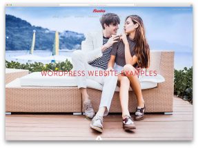
16. Pure CSS Masonry Layout with Flexbox
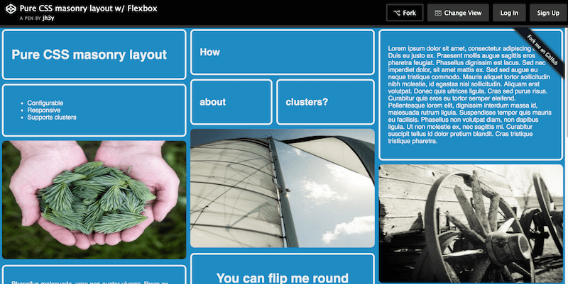
Jhey Tompkins is a CSS expert with more than 15,000 individual contributions on GitHub in the last year alone; what an amazing achievement! Many of his repositories on GitHub have over 100 stars, and he’s well-known among his peers. This particular CSS layout from Jhey also utilizes Flexbox to achieve a solid masonry layout, ready for your elements and website widgets. Some exciting features include “flip” individual grids for added creativity and highlighted ones once the user hovers over them. It is a perfect grid layout for a website project that involves a lot of content.
I hope this article helped you to find the best CSS layout for your net project. Additionally, you can check our list of the best CSS frameworks for front-end web development. For even quicker web development, you can use any of our website templates that have CSS layout already in place, and you can modify any aspect of them.
Related Posts


I want to create beautiful themes for professional uses to sell online.which codes do i need to learn? please advice…..waiting eagerly.
If you are planning on making WordPress themes you need HTML, CSS, JavaScript and PHP.
Photoshop, Dreamweaver, learn some CSS, HTML and JS.